How Liberal is LEED?
When we first published a map of LEED buildings per capita in 2011, we were accused of a political agenda by a few people. After the initial surprise and chuckle, our curiosity started to grow, after all, as energy-modelers we naturally gravitate towards analyzing data. So we asked ourselves, “What side would this map be on for a political agenda?”
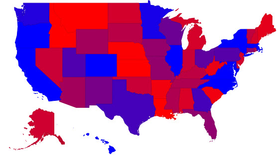
Can you guess which image is the presidential results?
Image 1

Image 2
It shouldn't be too difficult to tell, but Image 1 is the 2012 Presidential results and Image 2 is the LEED square footage Certified in 2013 per capita.
We don’t think of ourselves as particularly political here at energy-models.com, at least in terms of partisanship. We spend most of our time pondering about modeling buildings and training modelers. Though aspects of the industry and the environmental focus of modeling can be considered political, we don’t spend our free time reflecting on the partisan divides and motives of the green building industry.
Politics have changed since the release of our first LEED map and with our recent update to our LEED map tool we thought we’d playfully explore LEED and partisanship as reflected by the Popular Vote in the 2012 Presidential Election. We used varying shades of green in our first chart, which happens to be the default color scheme for geomaps.
To make things more political, we decided to change the color scale to vary from blue to red. We needed to determine which end to make blue. At first, it seems like a strong correlation because the number 1 area for LEED sqft per person certified in 2013 is Washington D.C., which also happens to hold the highest margin of victory for Obama (not included on the map, but we noticed this in the data). The number 1 state was ironically Illinois, home of Senator Barack Obama. Of the top 10 LEED states, 9 of them were victorious for Obama, including the big electoral states of New York and California. Once we took into consideration the rest of the west coast, it was pretty easy to decide to make the LEED Leaders blue. This would keep Alaska and Hawaii similarly divided, Florida somewhere in the middle and Illinois a spritely blue in a sea of red.
With our our color scale setting the LEED Leaders as blue and the other states as red, the next thing we needed to do was determine how to define where to draw the line on the states that were not obviously red or blue. Of course, it’s easy to decide the state’s color for the election. If the largest percent of people voted for Obama, then it is blue.
Determining where to draw the line on the LEED map produced more difficulty, especially given outliers. We experimented with several scenarios and noted that the results did not change much if we deleted some of the outliers. Thus, we added up the values for all the states and took the “Average Square foot of LEED certified building/person”. Ironically, this came out to be 1.00 sqft/person. Thus, any state with more than 1.00 square feet/person of LEED certified space came was deemed as blue, and anything less than this was deemed as Red.
When we cross-reference the two maps, 35 of 50 states are the same color, there are a few states, such as Florida that differed in color, but only by a few “hanging chads”. It looks that there are some partisan politics at play, but of course, if we remember our statistics classes, “correlation does not equal causation” and 30% of the states do not match.
At this point, it would seem we could draw a correlation, but there is an extreme anomaly in that logic: Texas is really, really blue, and the Northeast and Michigan are red. A closer examination of the data suggests the perceived similarity is possibly coincidence, but could possibly have a meaningful correlation. Maybe the best conclusion is that: LEED and Green Building incentives might not be such a issue of partisanship as some people tend to think. Perhaps on the extreme ends of the spectrum, it is still a partisan issue, considering that 9 of the top 10 LEED states are blue. That argument might hold, but that would mean that of the remaining 40 states, only 26 of them show corresponding colors, which is not statistically significant.
It should also be noted that during our determination of this data, it first appeared that Nevada was the number 1 state for LEED square footage per person in 2013. However, it was noted that Nevada had two large buildings that were denied certification. Thus, 1 or 2 certified buildings could change a state’s color.
Some of you might wonder why an energy-modeling website like us is analyzing this data. Well, the building energy-model is the single largest contributor to LEED points. LEED energy models are also the flagship of many LEED consulting firms. Thus, a better understanding of what motivates people to get LEED certified (and where) is helpful.
It’s up to us modelers to keep modeling and having a positive impact on the industry by doing what we do best: modeling and making the world a Greener place one building at a time. Maybe if the building energy-modeler had a little more training on the two buildings in Nevada that were denied, Nevada could have been the lead LEED state.
Can you draw a conclusion? What do you think? Let us know in the comments below.
